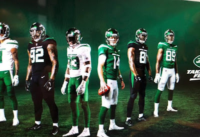
Well, here they are folks. One day before the team officially reveals them to the world, the New York Jets new uniforms have allegedly been leaked. While it isn't 100 percent certain, it appears very likely that these are the new uni's. Check it out.
While nothing will top the classic look the Jets have worn the previous 20-years, an homage to their lone Super Bowl season of 1968, these new uniforms are not bad. Certainly for Nike standards anyway.
The first thing that stands out is the green is indeed a lighter shade compared to its predecessor, and it does harken back slightly to the look of the 1980s and 1990s. The logo seems to be more divisive. A lot of people hate it, but it is a slight update of their current logo.
The NY is no longer behind the word mark Jets, instead New York is spelled out across the top, and the football is pushed up into the E and T in Jets. It's an update, not too dramatic, but still familiar. We like it.
On the helmet just the word Jets and a football appear splashed across a kelly green helmet. New York is spelled out across the top of the jersey, which has become a staple of Nike jersey's of late.
The Jets are indeed getting the black jersey, which will be accompanied by black pants and socks, and will likely be used as a color rush design for prime time games (when the Jets actually are in prime time).
Overall it is not a terrible look. It is clean and sleek. Compared to the radical uniforms we have seen in recent years i.e. Seattle, Tampa Bay, Miami, Cleveland, this new uniform combination is actually playing it safe.

Comments